For students pursuing fine arts or design in a liberal arts degree program, having a strong understanding of color theory is crucial. Color theory involves the technique of combining colors based on the color wheel, which is a visual representation of primary, secondary, and tertiary colors. It is imperative for artists, designers, marketers, and brand owners to possess accurate knowledge of color combination using the color wheel and comprehend the relationship between colors. By mastering color theory, students will be able to create compelling and visually appealing designs that communicate their intended message effectively.
Primary Colors
The three primary colors are yellow, blue, and red. They cannot be produced by mixing any other colors together. Secondary colors, on the other hand, are created by blending these primary colors. Tertiary colors are formed by mixing secondary colors. Essentially, all colors are derived from these three primary colors.
Secondary Colors
Secondary colors are created by blending equal amounts of two primary colors. The secondary colors include orange, purple, and green. Mixing red and yellow will produce orange, while blue and yellow will result in green. Combining red and blue will create purple. It’s important to note that the ratio of each color used when mixing them will affect the final hue. For instance, mixing 1 part red with 1 part blue will create a specific shade of purple, while using 1 part red with 2 parts blue will produce a darker, more blue-toned hue of purple.
- Simplifying Mixing Colors for Artists
- Create Secondary Colors From Multicolored LEDs
- How to Mix Bright and Dull Secondary Colors
Tertiary Colors
Intermediate colors, also known as tertiary colors, are produced by mixing equal amounts of primary and secondary colors. These colors are often named after the two colors used to create them, such as blue-green or orange-red, but they can also have unique names. There are six tertiary colors in total: vermilion (red-orange), magenta (red-purple), violet (blue-purple), teal (blue-green), chartreuse (yellow-green), and amber (yellow-orange).
- How to Mix Color: Mixing With Tertiary Colors
- The Great Tertiary Color Debate
- Oil Painting Techniques: Why We Need Color Theory
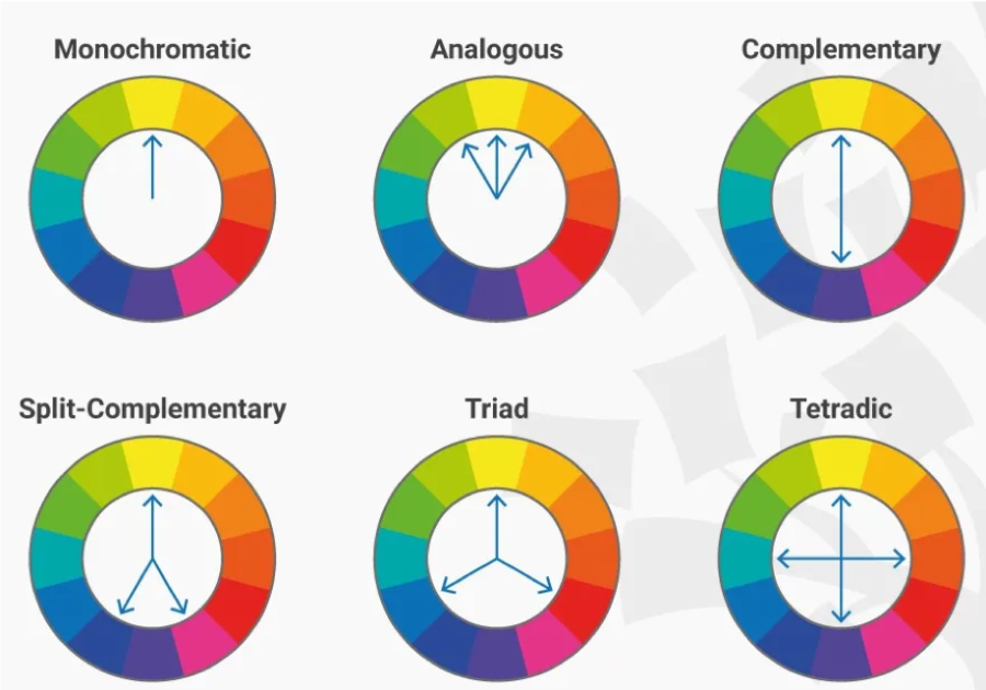
Complementary Colors
Complementary colors are hues that contrast with each other and are positioned exactly opposite one another on the color wheel. The color wheel is an arrangement of all colors on the spectrum based on their relationships, and it’s useful in creating harmonious color schemes. Complementary colors enhance each other’s intensity when placed right next to each other, which is why they’re often used to create bold, high-contrast images that pop.
- Let’s Make Mud: Understanding and Mixing Complementary Colors
- Complementary Colors
- Complementary Colors, Afterimages, Retinal Fatigue, Color Mixing, and Contrast Sensitivity
Analogous Colors
Analogous colors refer to colors that are positioned adjacent or close to each other on the color wheel. These colors have a natural affinity for one another and tend to create a harmonious and soothing effect when used together, unlike the stark contrast of complementary colors. Analogous color schemes typically have a dominant color, a secondary color that complements it, and an accent color that adds depth to the composition. These color schemes are frequently used in artworks that depict tranquil landscapes or nature scenes to create a sense of harmony and balance.
- Learn the Basics of Color Theory to Know What Looks Good
- Using the Color Wheel: Color Theory Tips for Artists and Painters
The Color Wheel
The color wheel, also known as the color circle, is a circular arrangement of colors that are grouped together based on their chromatic relationships. The wheel has primary colors that are evenly spaced from each other, and secondary and tertiary colors are located between them. Artists and designers use the color wheel to select colors and color schemes based on their relationships to one another, making it an essential tool for art and design.
- Learn the Basics of Color Theory to Know What Looks Good
- Using the Color Wheel: Color Theory Tips for Artists and Painters
Color Relationships
Color theory can be illustrated in various ways, with the color wheel being the most widely recognized method. However, there are other means to depict color relationships, such as the painters’ color triangle, the printers’ color triangle, and Goethe’s nine-part harmonic triangle. Each of these alternative representations offers a unique perspective on color theory, and they can be useful in different contexts. For example, the painters’ color triangle is a tool used by artists to understand the mixing of colors, while the printers’ color triangle is essential in the printing industry. Similarly, Goethe’s harmonic triangle, which expands on the traditional color wheel, takes into account the emotional and psychological effects of color. These alternative representations of color relationships offer a more nuanced and comprehensive understanding of color theory.
Painters’ Color Triangle
The painters’ color triangle is an arrangement of colors in a triangle shape, with one primary color at each corner and their secondary and tertiary colors in between. In contrast to the color wheel, the painters’ color triangle puts more emphasis on the primary colors and makes it easier to see the combinations between them due to its three-sided shape.
Printers’ Color Triangle
The printing process uses different core colors instead of the red, yellow, and blue used in painting. In printing, the primary colors are magenta, cyan, and yellow. The printers’ color triangle is modeled after the painters’ color triangle, but the three corners are occupied by the printing primary colors instead.
Nine-Part Harmonic Triangle of Goethe
Goethe’s color triangle is another way of depicting color relationships with an emphasis on the three primary colors. In it, both the painters’ primary colors and printers’ primary colors are represented. The three printers’ primaries are located at the three main vertices on the triangle. With dark neutral tertiaries between the primary colors, the way the triangle divides allowed Goethe to choose colors based on moods.
More Information on Color and Design
- Color Theory: Color theory is relevant to all areas of art, design, fashion, and brand marketing. This page gives you an overview of color theory and how to use it in design.
- Color Contrasts: This resource depicts examples of colors that contrast with each other in different ways.
- Understanding Color and the Meaning of Color: A great resource for graphic, Web, and product designers, this article discusses how color affects company recognition and the way people feel about a brand.
- Color Theory for Designers: The Meaning of Color: This article covers the basics of color theory and the impact of color on design. It presents graphic materials used by brands that use different color relationships.
- The Psychology of Color for Interior Design: This article advises on interior design color scheme choice and provides examples of furnished rooms with different color schemes.
- Styling 101: Color Combinations: Warm colors, cool colors, and neutral colors are key concepts in fashion, beauty, and styling. This article discusses the significance of these different color groups in fashion and provides examples of outfits in monochromatic, complementary, analogous, split complementary, and triadic color schemes.
- How to Use Colors in Graphic Design for Impact: Different colors provoke different psychological effects when you observe them. This article points out the various associations that people unconsciously assign to each color. It also lists online tools that graphic and Web designers can use to select color schemes.

